
Product · August 3, 2026
How I gave Pippa a new look
When you open Pippa, the first thing you see is the home screen. For a while it was just doing too much, so I sat down and reworked the buttons to make it cleaner and a lot easier to get around.
Where I started
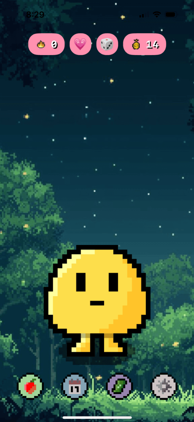
The idea was to put everything within reach, but it ended up feeling busy. There were four rounded chips lined up across the top, and four small circle buttons at the bottom that all looked about the same. Nothing really told you what to do first, and the main thing you actually open Pippa for is to log a meal. When every button looks equally important, none of them do, and you end up searching for the one you want.
What I changed
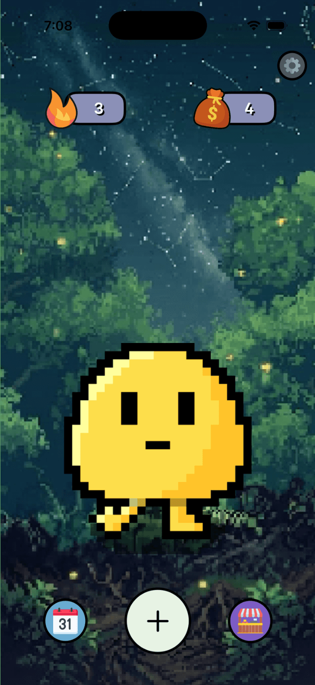
I moved a few things around and the whole screen calmed down.
First, I cut the top row down to the two things actually worth a glance, your streak and your coins, and pushed them out to the edges so they sit at the corners instead of crowding the middle. The other chips that used to live up there either moved somewhere that made more sense or got tucked away, so now the top reads instantly.
I also pulled settings out of the button row and put it in a little gear in the top right corner. That is where people expect settings to be anyway, and it freed up the bottom for the stuff you actually use every day.
The bottom row is the biggest change. Instead of four small buttons that all looked the same, there is now one big button in the middle, the plus, for logging, with the calendar on one side and the shop on the other. Logging is the whole reason to open Pippa, so I made it the biggest and most obvious thing on the screen. Everything else steps back around it.
Why it is easier to use now
The whole point was to give the screen a clear order. One main action, a couple of side destinations, and a few quiet little indicators, each one sized and placed based on how often you actually reach for it. You do not have to scan a row of identical buttons anymore. Your eye goes straight to the plus, and everything else is right where you would expect it.
Less on the screen, more room to breathe, and a straight shot to the thing you came to do. That was the goal, and it is just a nicer screen to open every day.